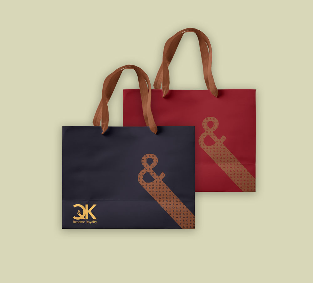
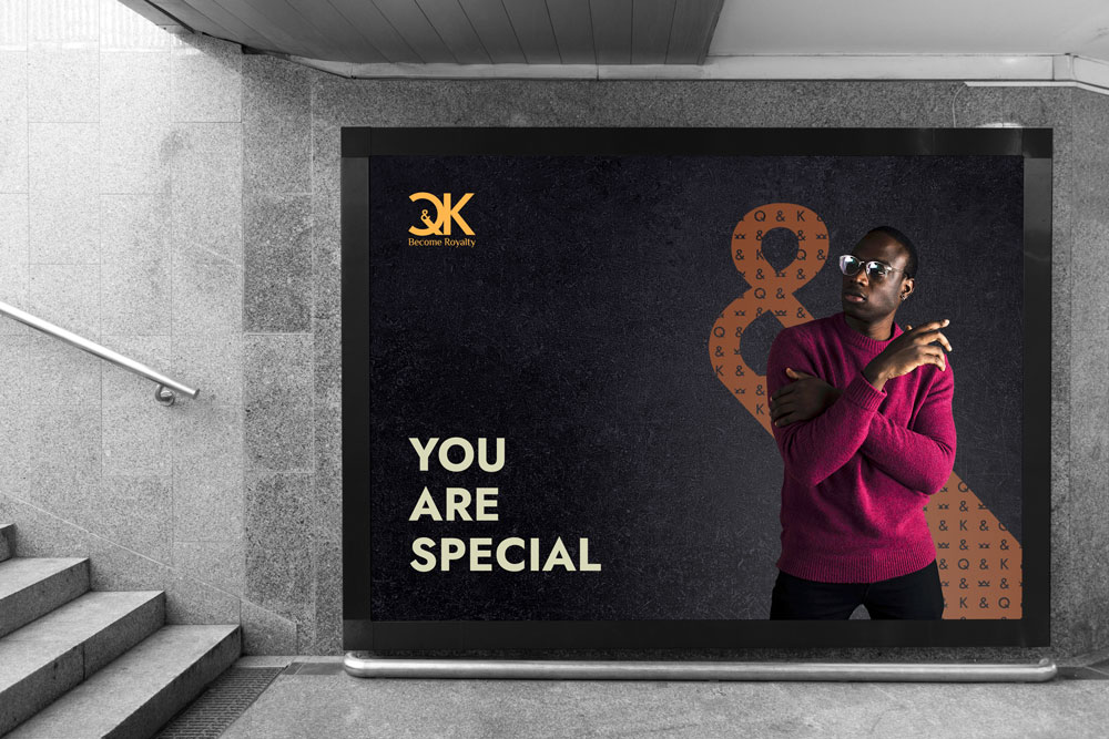
The main value of Q&K apparel brand is to bring the royal status to their life through their clothing, regardless of how they look, their scars, color, gender, age..., as Q stands for queenage and K for kingnage.


The biggest challenge was how to integrate the "&" character in the logo to make it special and distinctive, regarding its ample use in brands' names. As I took advantage of that and made it the signature of the brand as you saw on the first image above.


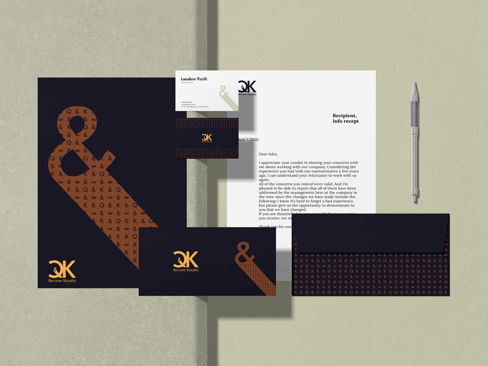
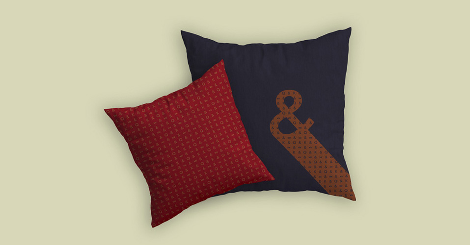
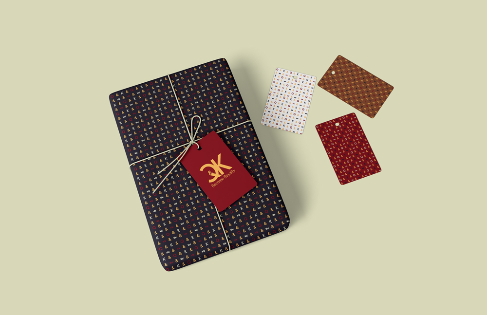
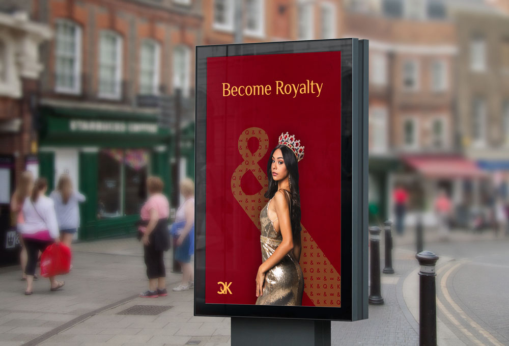
This font and color palettes are the only thing to use on the whole brand elements to keep it all cohesive and never change its personality.


Let's raise your head high with a compelling identity design!