I’m a graphic designer, specifically logo and visual identity/brand identity designer. And here is how to design a logo for your brand by yourself, the same process and resources I personally use to design logos that stand out, and that speaks for my clients’ brands personalities.
Before starting out, you need to let go of your emotions, because it’s not about you or what you like (don’t worry! Just keep reading), it’s about the brand and what works for its identity. However, you’ll end up picking up the one you like most, there is a difference between designing what you like and liking what you design.
To keep in mind:
Comprehending the brand’s identity is a crucial step because design is subjective, if you don’t get it right, you may end up designing a logo for a different brand.
These are the main brand aspects you need to understand:
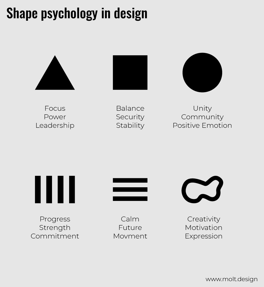
There is a psychological explanation for the basic geometric shapes and lines that needs to be respected according to the brand identity.
Geometric shapes are easier to remember and to draw for the audience, the reason why I prefer to use them in logo design. Because you don’t want to make something that is uncomfortable or hard to remember for the audience, you need to make things easier for them.
Here is a guide to choose the appropriate shape for the brand’s logo as a whole (e.g. Adidas is a triangle, Apple is a circle):
Example of a square logo here.
This is to get an idea about the essential logo types and to choose the one that would suit the brand best.
If you are looking for a wordmark, just skip to 10 - Font psychology.

BUT! You can always choose whatever you think would work for the brand.
Write down every keyword you can think of that describes the brand or has anything to do with it. And you may, of course, use the web to get some help.
I mostly use:
Highlight the most relevant of the keywords.
Search the web for every relevant visual element (logos, symbols, shapes, drawings…) that represent every keyword, and more importantly for your competitor’s logos, to get inspired and not to make something that already exists. Then, sketch them down.
Be original, don’t be genetic.
I mostly use:
This is a brainstorming sketch.
Play with what you came up with and maybe combine some together. Just explore your ideas, either good or bad (because sometimes you can get the best result just from enhancing a bad one), until you get the best results.
And don’t forget to sketch according to the overall shape you first picked up for the logo (2- Shape up).
Use black and white only, no colors yet!
In the results you’ve got, select 3 (max) that you think would work best as the brand’s logo, make them as simple as possible, take off whatever you think is unnecessary without losing the message, or maybe redesign the sketches again and again.
Then…
Do this to all 3 of them one by one, to make sure they would work on small sizes, and/or when they’re far from you.
On-screen, scale down to 16 pixels (the size of a favicon, the icon you see on a navigator’s tab).
If they’re not clear enough, go back to 7 - Create, and keep trying until you get it right.
-
It takes time to design a good logo, it’s not an overnight success. It’s a brand’s most important visual element we’re talking about here! So, invest some of your time in, no rush! It may take an hour, a day, or maybe a month to come up with something good.
If you’re out of inspiration, do something that will distract you for a bit, or something that is boring (jog, walk, shower…) to clear up your brain and to let it think freely, or just sleep on it, to let it all sink into your brain, and maybe tomorrow you’ll have better ideas.
-
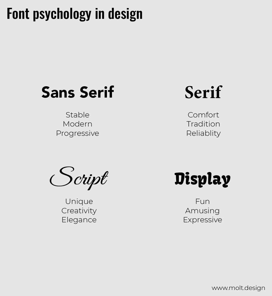
Remember! Choose the one that works for the brand. Typography plays a fundamental role in design in general. Professional typography/type/font/typeface designers spend about 150 hours designing them to look the way they do, so:
And please, make sure it’s easy to read!
If not, what’s even the point?
An example of a word-mark with the right font here.
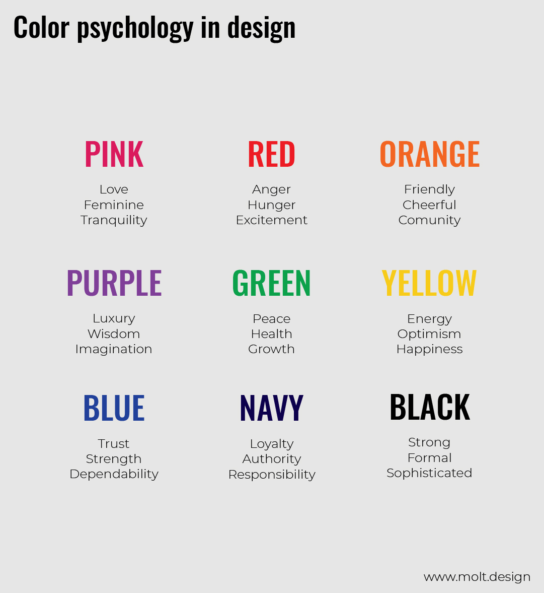
You can use more than one color, but I prefer to stick with just one for logo design, because of the contrast and background issues.
This is a guide on how to choose the appropriate color for your design (main colors):
Congratulations, you just got yourself a great logo!
I would love to see it, e-mail it to me at hello@molt.design
-
As you noticed, there is a lot of psychology going on in logo design. The main challenge is, how to combine all that in one simple, distinctive and appropriate visual element, to get a final harmonic professional logo design that does the job, and speaks for the brand’s identity.
From here on, try not to be just passive anymore, always analyze everything (shapes, fonts, colors…) big brands do with their visuals, because now you know it’s not random, now you know it’s intentional.
-
If this sounds too much, let me do it for you.
It's what I do best!
Let's raise your head high with a compelling design!
When it comes to your business, you don’t want to do this kind of mistakes, you need to get the best solution, you need to...
A brand identity consists of three essential elements: brand visuals, brand verbals, and brand behaviorals. However, most people...